Page 25 - IFIA_Magazine_No16
P. 25
IFIA Magazine
                                                                                                      March 2023


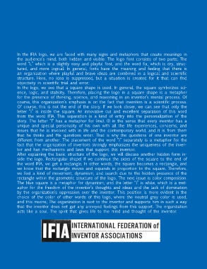
 What does  In the IFIA logo, we are faced with many signs and metaphors that create meanings in


           the audience’s mind, both hidden and visible. The logo font consists of two parts; The
           word “i,” which is a slightly easy and playful font, and the word fia, which is dry, struc-
           tured, and more logical. In general, fonts have the meaning and feeling that there is
           an organization where playful and brave ideas are combined in a logical and scientific
           structure. Here, no idea is suppressed, but a situation is created for it that can find
           objectivity in scientific trial and error.
           In the logo, we see that a square shape is used. In general, the square symbolizes sci-
 logo symbolize?  ence, logic, and stability. Therefore, placing the logo in a square shape is a metaphor

           for the presence of thinking, science, and reasoning in an inventor’s mental process. Of
           course, this organization’s emphasis is on the fact that invention is a scientific process.
           Of course, this is not the end of the story. If we look closer, we can see that only the
           letter “i” is inside the square. An innovative cut and excellent separation of this word
           from the word IFIA. This separation is a kind of entry into the personalization of the
           story. The letter “I” has a metaphor for (me). (I) in the sense that every inventor has a
           unique and special personality of his own with all the life experiences, concerns, and
           issues that he is involved with in life and the contemporary world, and it is from them
           that he thinks and His questions enter. That is why the questions of one inventor are
           different from another. The placement of the word “i” separately is a metaphor for the
           fact that the organization of inventors strongly emphasizes the uniqueness of the inven-
           tor and has mechanisms and laws that support this inventor.
           After explaining the basic structure of the logo, we will discuss another hidden form in-
           side the logo. Rectangular shape! If we continue the sides of the square to the end of
           the word IFIA, we get a rectangle. In other words, the square becomes a rectangle, and
           we know that the rectangle moves and expands in proportion to the square. Therefore,
           we feel a kind of movement, dynamism, and search due to the hidden presence of the
           rectangle within the geometric structure of the logo. The next issue is color composition.
           The blue square is a metaphor for dynamism, and the letter “i” is white, which is a met-
           aphor for the freedom of the inventor’s thoughts and ideas and the lack of domination
           by the organization’s oppression over the inventor. This position is more evident in the
           choice of the color of other words of this logo, where the neutral gray color is used,
           and this means; The organization is next to the inventor and supports him in such a way
           that the inventor does not get any annoyed feelings from this support. The organization
           acts like a soul. The spirit that gives life to the mind and thought of the inventor.


                                                                                                             23

